
T
Thierry Ciot
Guest
Kendo UI Builder comes with many built-in components and supports the implementation of custom components as well. Check out four newly released custom components that can be used in conjunction with each other to create interesting modern views.
In this blog, we are going to see a set of newly released custom components and how they can be combined to create interesting modern views. The recently released components are:
All these components are able to:
They are all available from github here.
The rest of this blog is divided into two parts: The first part shows examples using these components and highlights various properties, the second describes the components at a high level.
Combining the Components
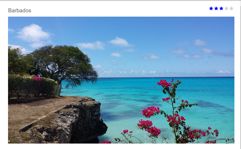
In this first example, we have a REST service providing data for travel destinations. The three components are bound to different fields of the same data source record. When a destination is selected in the view, we show the destination name, its rating and an image.
Note how:
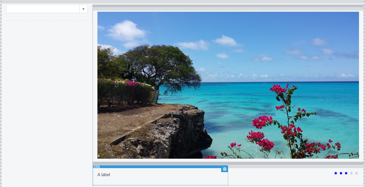
 In this second example, you can see the rating and the label components are placed below the image and are aligned left and right respectively.
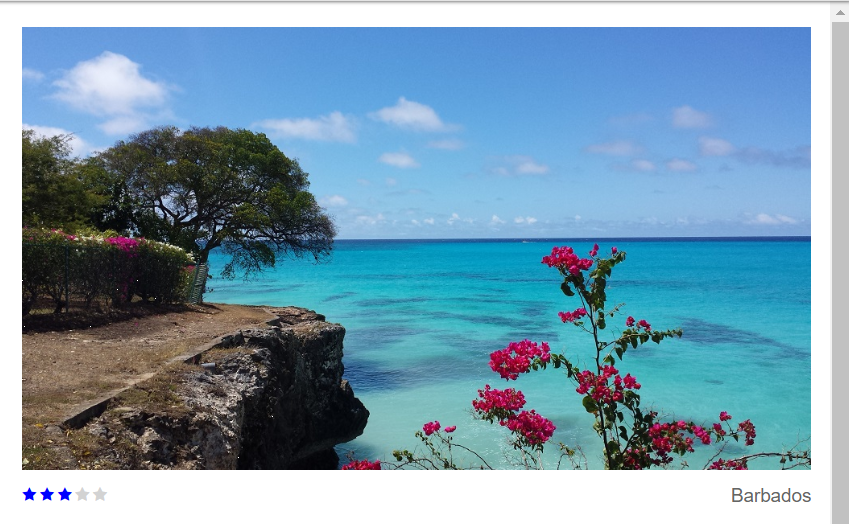
In the first example, we inserted some vertical spacing via the margin bottom property while in the second example we used margin top.
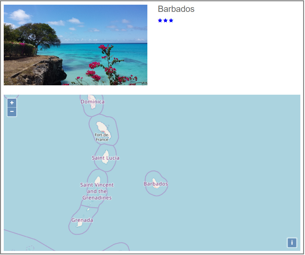
In this third and final example below, we have added the map component to show a view combining the four components:
In all of these examples, the full power of Kendo UI Builder comes to the forefront. These views were created by simply dragging the components to the designer canvas and setting or adjusting some properties with just a few clicks.
Hopefully, you will find these components useful in your own applications, as is. As the complete source code is available from github here, you are welcome to tailor or augment them based on your own needs. They can also be used as a starting point for your own components.
Below, you will find the components description.
In the next blog, we will see how we can create modern views using a card container instead of a traditional grid rendering. Stay tuned")
Components Description
Map Component
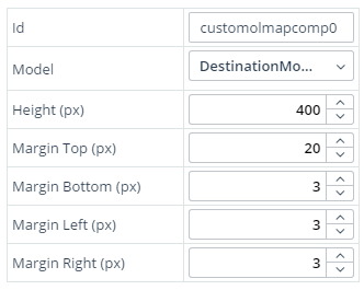
This component is available in github here and is based on the OpenLayer map library.The component is primarily driven by coordinates (latitude and longitude numbers) obtained from the data source.
It is assumed the REST data for these numbers is available at fields lon and lat. If you have a different schema, you can simply change the property names in components/custom-olmap-comp/angular/template.html.ejs in the following lines:
[lon]="$dataModels.<%- model %>.lon"
[lat]="$dataModels.<%- model %>.lat"
Change .lon and .lat to your corresponding field name.
You also specify what height you want the map to be. The width will be automatically adjusted to fit the container in the grid system.
Here are all properties:
Finally, to use this component, you will need to include these two files in the head (see OpenLayer doc here):
<link rel="stylesheet" href="https://openlayers.org/en/v4.6.5/css/ol.css" type="text/css">
<script src="https://openlayers.org/en/v4.6.5/build/ol.js" type="text/javascript"></script>
We add these to the Kendo UI Builder app properties, head. See this Kendo UI Builder documentation for information on how to do that.
New Rating Component
This component is available in github here. Its main improvements are:
1. The ability to show the rating range. When this mode is on, we always show five rating icons and only color the icons corresponding to the rating. For example, a three-star rating would result in three colored icons and two greyed out icons, like this:

When the mode is off, we only show icons for the rating value, like this:

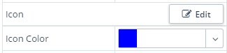
There are many scenarios where you may need a different colors or icons, so fortunately we are not constrained to just a blue star rating. With just a few clicks, we can select a different icon and color with the following designer properties:
Here is an example with a green dollar symbol:

2. Ability to specify both the top and bottom margin properties. Now, you can align the component with other components in the grid system with just a few clicks—no need to go override any CSS.
3. Ability to align the rendering of the rating to the left, center or right of the container. This is particularly useful when using the responsive grid system and an item below or above is using more width than the column in which the rating component is located. Here is an example where we need to align to the right:
Custom Dynamic Label Component
This component is available in github here. The value of this component is to show a label dynamically from a selected data source item. For example, showing a destination description when selecting a destination from a combo-box.
Additionally, you can align the label to the right, left or center of the container, as well as changing the font size and specifying the margins.
Here is the list of properties:
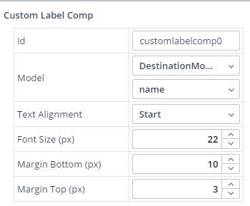
Image URL Component
After receiving your feedback, I have implemented four properties to make it easier to align the image with other components in the view. With just a few clicks, you can quickly adjust:
And most importantly, you can see the effect of adjusting these properties on the designer canvas.
The updated component is available in github here.
Continue reading...
In this blog, we are going to see a set of newly released custom components and how they can be combined to create interesting modern views. The recently released components are:
- Map component
- New rating component
- Custom Dynamic label
- Improved image URL components
All these components are able to:
- Be deployed with point-and-click configuration of the data to render
- Render data from any data source
- Play well in the grid system
- Be used without additional coding—they have numerous point-and-click properties to minimize coding while maximizing portability.
They are all available from github here.
The rest of this blog is divided into two parts: The first part shows examples using these components and highlights various properties, the second describes the components at a high level.
Combining the Components
In this first example, we have a REST service providing data for travel destinations. The three components are bound to different fields of the same data source record. When a destination is selected in the view, we show the destination name, its rating and an image.
Note how:
- The label and rating components use 50% of the image width
- The rating component is aligned to the right of the container
In this second example, you can see the rating and the label components are placed below the image and are aligned left and right respectively.
In the first example, we inserted some vertical spacing via the margin bottom property while in the second example we used margin top.
In this third and final example below, we have added the map component to show a view combining the four components:
- The map component occupies 100% of the available width and is configured with a specific height (400 pixels).
- The image component occupies 50% of the width and the height is automatically adjusted to keep the proper image ratio.
- The destination name and rating components are stacked and use the remaining 50%.
- We leverage the margin properties to have proper spacing. For example, we didn't want the label and star rating to touch the image, but we did want enough vertical spacing between the label and rating components as well as between the image and the map.
In all of these examples, the full power of Kendo UI Builder comes to the forefront. These views were created by simply dragging the components to the designer canvas and setting or adjusting some properties with just a few clicks.
Hopefully, you will find these components useful in your own applications, as is. As the complete source code is available from github here, you are welcome to tailor or augment them based on your own needs. They can also be used as a starting point for your own components.
Below, you will find the components description.
In the next blog, we will see how we can create modern views using a card container instead of a traditional grid rendering. Stay tuned
Components Description
Map Component
This component is available in github here and is based on the OpenLayer map library.The component is primarily driven by coordinates (latitude and longitude numbers) obtained from the data source.
It is assumed the REST data for these numbers is available at fields lon and lat. If you have a different schema, you can simply change the property names in components/custom-olmap-comp/angular/template.html.ejs in the following lines:
[lon]="$dataModels.<%- model %>.lon"
[lat]="$dataModels.<%- model %>.lat"
Change .lon and .lat to your corresponding field name.
You also specify what height you want the map to be. The width will be automatically adjusted to fit the container in the grid system.
Here are all properties:
Finally, to use this component, you will need to include these two files in the head (see OpenLayer doc here):
<link rel="stylesheet" href="https://openlayers.org/en/v4.6.5/css/ol.css" type="text/css">
<script src="https://openlayers.org/en/v4.6.5/build/ol.js" type="text/javascript"></script>
We add these to the Kendo UI Builder app properties, head. See this Kendo UI Builder documentation for information on how to do that.
New Rating Component
This component is available in github here. Its main improvements are:
1. The ability to show the rating range. When this mode is on, we always show five rating icons and only color the icons corresponding to the rating. For example, a three-star rating would result in three colored icons and two greyed out icons, like this:
When the mode is off, we only show icons for the rating value, like this:
There are many scenarios where you may need a different colors or icons, so fortunately we are not constrained to just a blue star rating. With just a few clicks, we can select a different icon and color with the following designer properties:
Here is an example with a green dollar symbol:
2. Ability to specify both the top and bottom margin properties. Now, you can align the component with other components in the grid system with just a few clicks—no need to go override any CSS.
3. Ability to align the rendering of the rating to the left, center or right of the container. This is particularly useful when using the responsive grid system and an item below or above is using more width than the column in which the rating component is located. Here is an example where we need to align to the right:
Custom Dynamic Label Component
This component is available in github here. The value of this component is to show a label dynamically from a selected data source item. For example, showing a destination description when selecting a destination from a combo-box.
Additionally, you can align the label to the right, left or center of the container, as well as changing the font size and specifying the margins.
Here is the list of properties:
Image URL Component
After receiving your feedback, I have implemented four properties to make it easier to align the image with other components in the view. With just a few clicks, you can quickly adjust:
- Margin left
- Margin right
- Margin top
- Margin left
And most importantly, you can see the effect of adjusting these properties on the designer canvas.
The updated component is available in github here.
Continue reading...